平常小程序写的多一些,简单总结一下原理。但因为小程序也没开源,只能参考相关文档以及开发者工具慢慢理解了。
理解小程序原理的突破口就是开发者工具了,开发者工具是基于 NW.js,一个基于 Chromium 和 node.js 的应用运行时。同时暴漏了 debug 的入口。
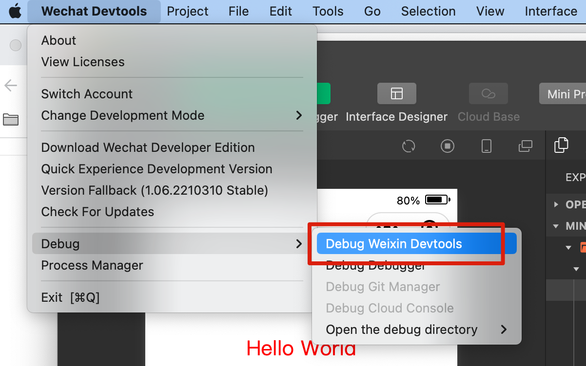
点开后就是一个新的 devTools 的窗口,这里我们可以找到预览界面的 dom。
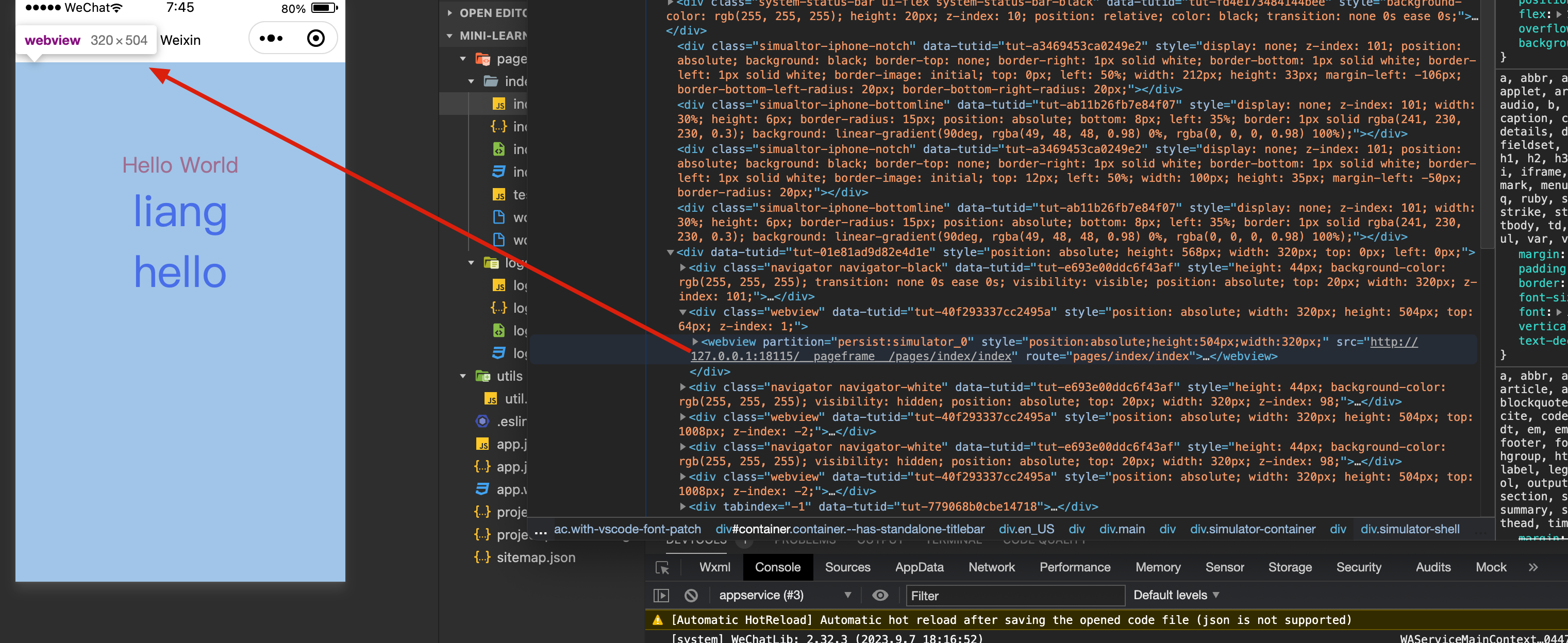
小程序界面是一个独立的 webview,也就是常说的视图层,可以在命令行执行 document.getElementsByTagName('webview') ,可以看到很多 webview。
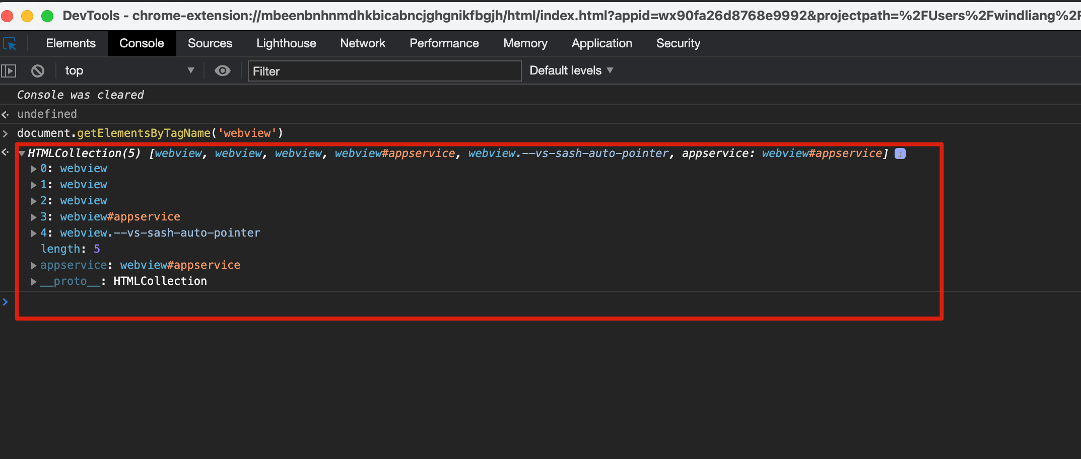
我这边第 0 个就是 pages/index/index 的视图层,再通过 document.getElementsByTagName('webview')[0].showDevTools(true) 命令单独打开这个 webview 。
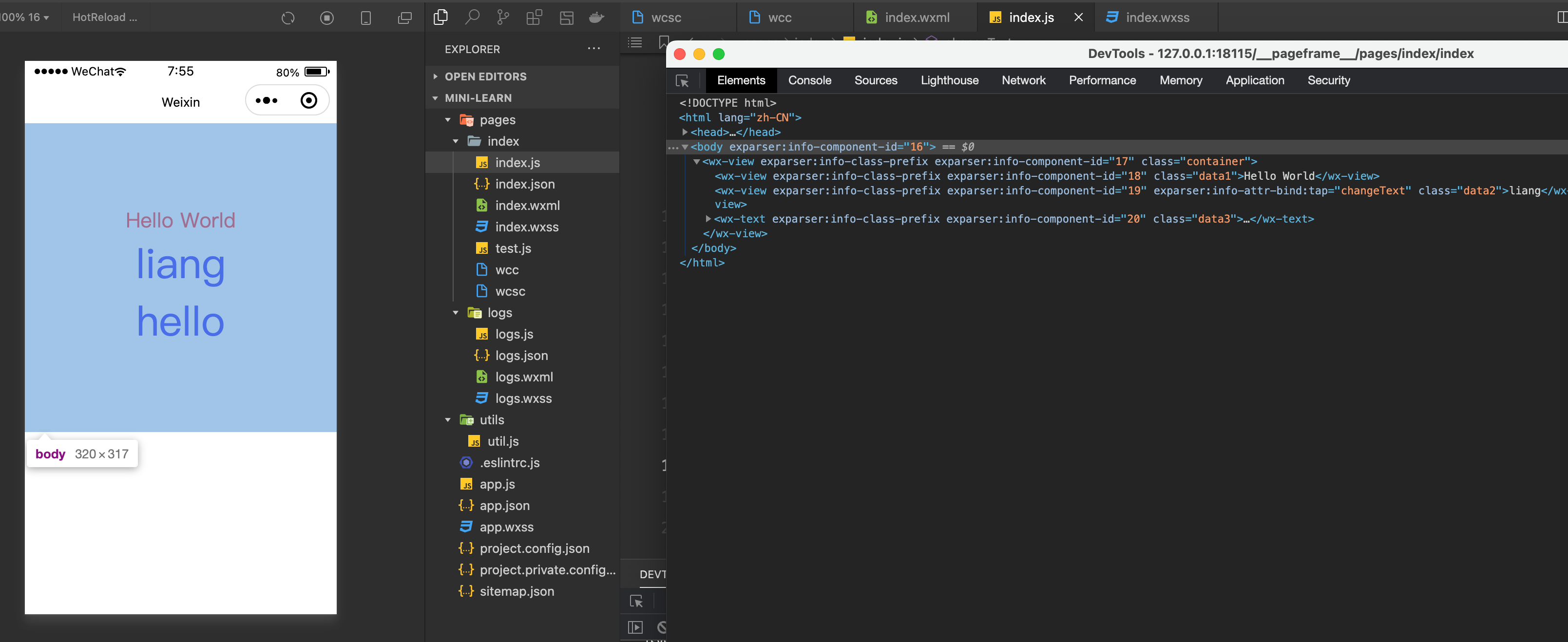
熟悉的感觉回来了,其实就是普通的 html/css ,小程序的原理的突破口也就在这里了。
这篇文章简单看一下页面的样式是怎么来的,也就是 wxss 做了什么事情。
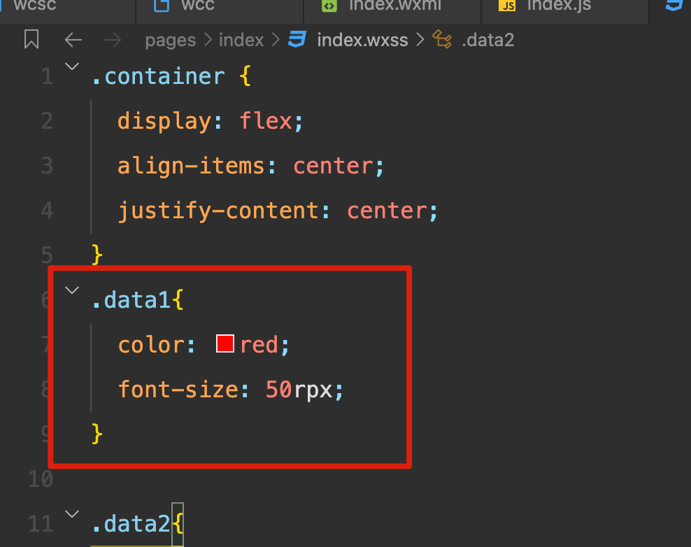
源码中 data1 的样式:
开发中工具中对应的样式:
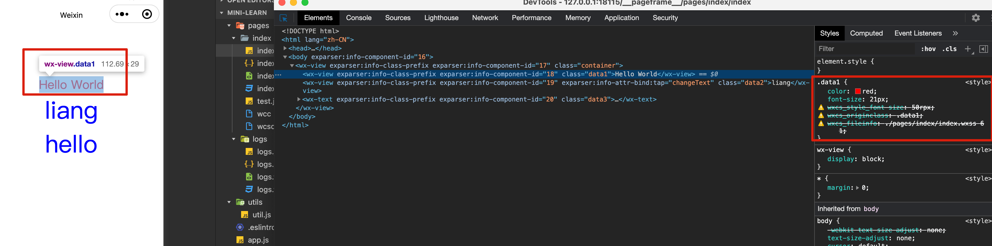
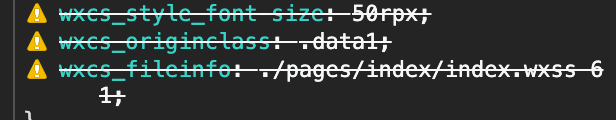
rpx 的单位转成了 px ,同时保留网页不认识的属性名,大概就是为了方便的看到当前类本身的属性和一些文件信息。
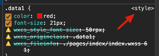
这个样式是定义在 <style> 中,
让我们展开 <head> 找一下:
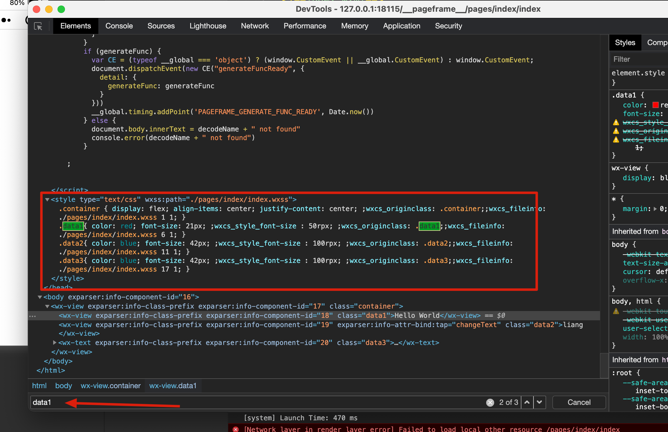
data1 确实在 <style> 中,继续搜索,可以看到这里 <style> 中的内容是通过在 <script> 执行 eval 插入进来的。
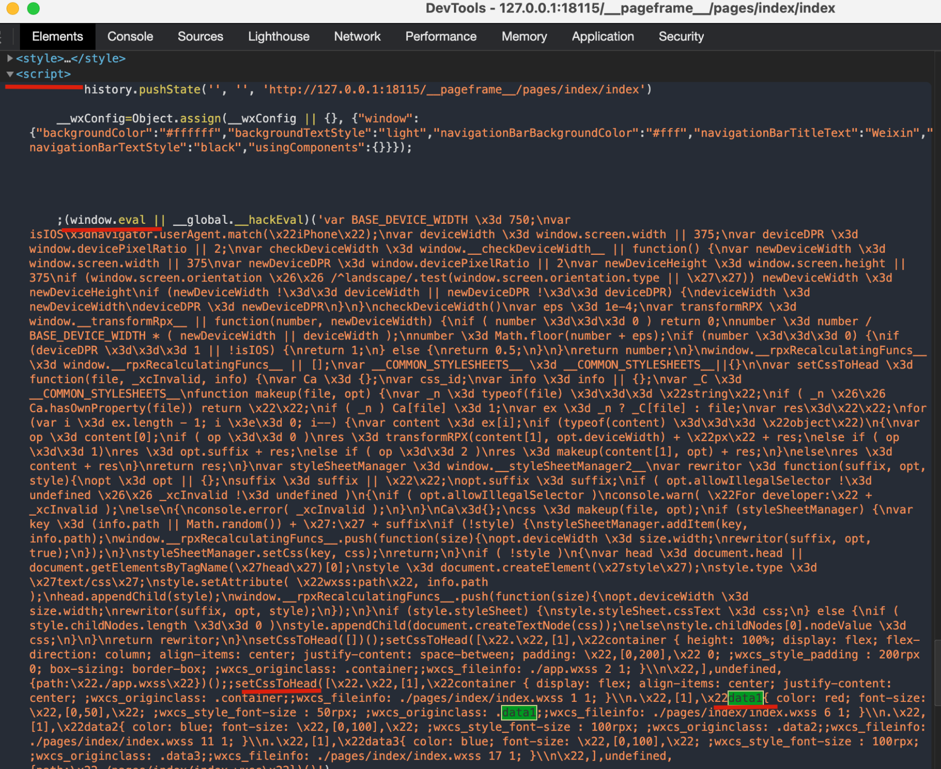
把这一段代码丢给 chatGPT 整理一下:
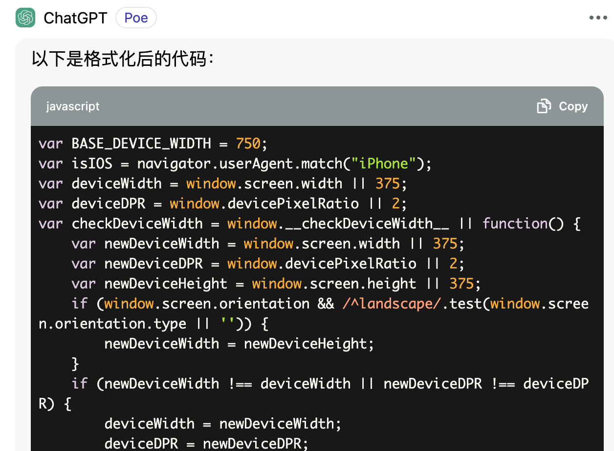
来一段一段看一下:
设备信息
1 | var BASE_DEVICE_WIDTH = 750; |
主要更新了几个变量,deviceWidth、deviceDPR ,像素相关的知识很久很久以前写过一篇文章 分辨率是什么?。
这里再补充一下,这里的 deviceWidth 是设备独立像素(逻辑像素),是操作系统为了方便开发者而提供的一种抽象。看一下开发者工具预设的设备:
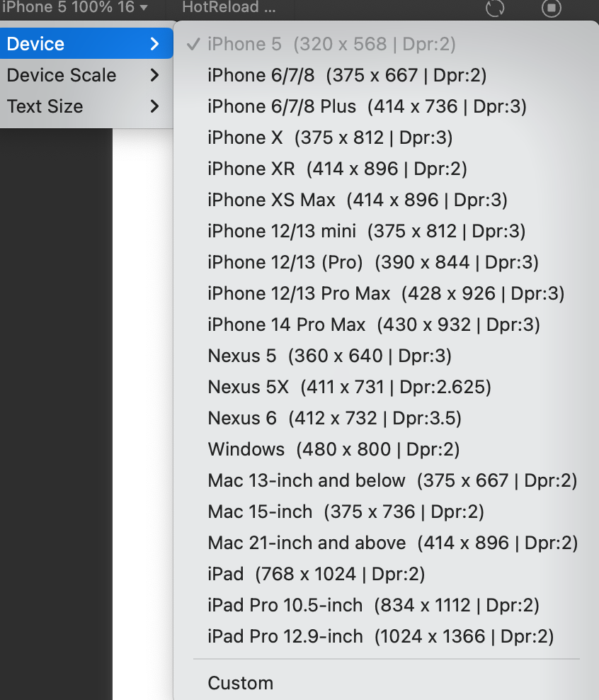
如上图,以 iphone6 为例,宽度是 375 ,事实上 iphone6 宽度的物理像素是 750。
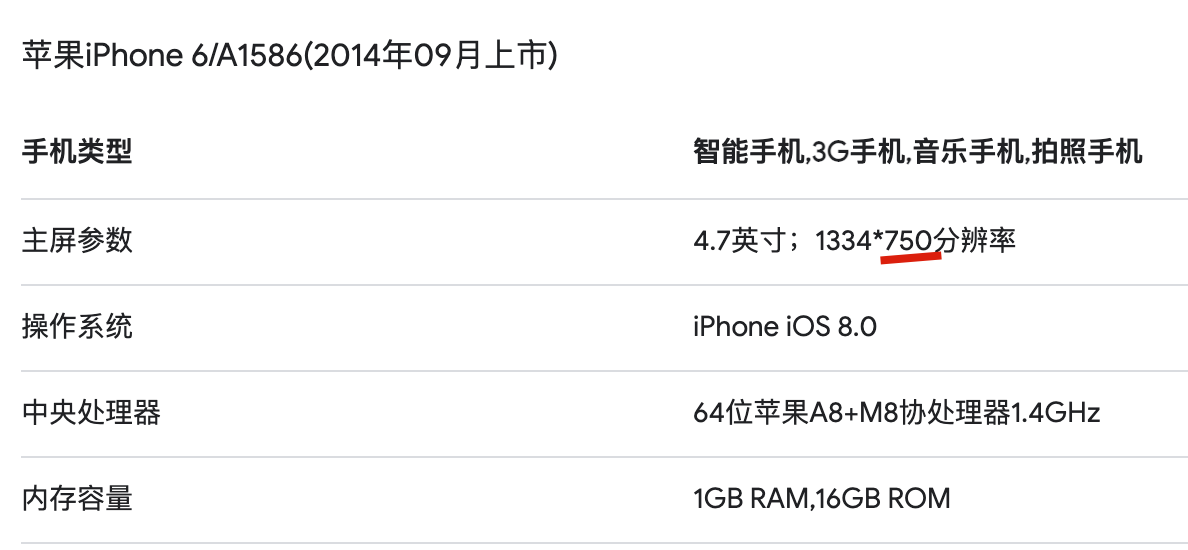
所以就有了 Dpr 的含义, iphone6 的 dpr 是 2, 1px 相当于渲染在两个物理像素上。
rpx 转换
1 | var eps = 1e-4; |
核心就是这一行 number = number / BASE_DEVICE_WIDTH * (newDeviceWidth || deviceWidth); ,其中 BASE_DEVICE_WIDTH 是 750 ,也就是微信把屏幕宽度先强行规定为了 750 ,先用用户设定的 rpx 值除以 750 算出一个比例,最后乘上设备的逻辑像素。
如果设备是 iphone6 ,那么这里设备的逻辑像素就是 350,所以如果是 2rpx ,2/750*375=1 最后算出来就是 1px ,实际上在 iphone6 渲染的是两个物理像素,也就是常常遇到的 1px 过粗的问题,解决方案可以参考这篇 前端移动端1px问题及解决方案。
接下来一行 number = Math.floor(number + eps); 是为了解决浮点数精度问题,比如除下来等于 3.9999999998 ,实际上应该等于 4 ,只是浮点数的问题导致没有算出来 4 ,加个 eps ,然后向下 floor 去整,就可以正常得到 4 了,关于浮点数可以看 一直迷糊的浮点数。
接着往下看:
1 | if (number === 0) { |
在 transformRPX 函数整个代码里第一行 if (number === 0) return 0; ,number 等于 0 已经提前结束了,所以这里 number 得到 0 就是因为除的时候得到了一个小数。
如果 deviceDPR === 1,说明逻辑像素和物理像素是一比一的,不可能展示半个像素,直接 return 1 。
如果不是 iOS 也直接返回 1 ,这是因为安卓手机厂商众多,即使 deviceDPR 大于 1 ,也不一定支持像素传小数,传小数可能导致变 0 或者变 1 ,为了最大可能的保证兼容性,就直接返回 1。
对于苹果手机,据说是从 iOS 8 开始支持 0.5px 的,但没找到当时的官方说明:
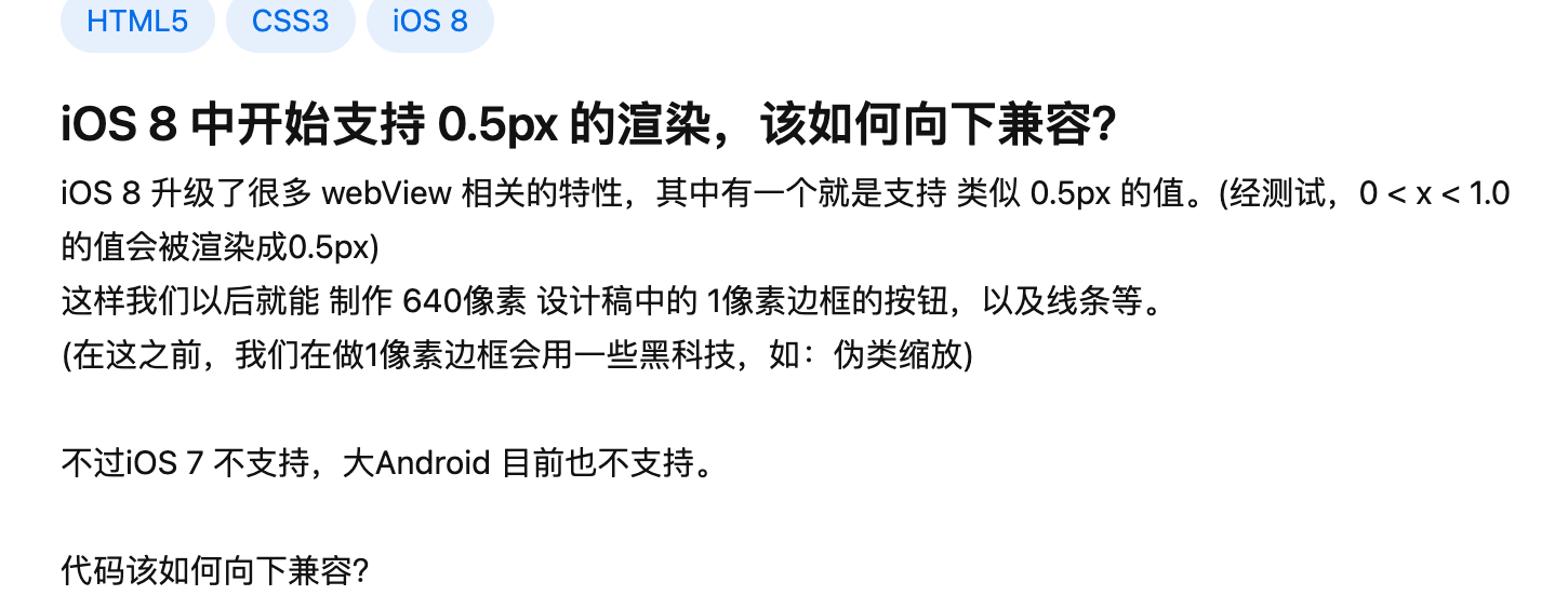
因此上边的代码中,对于 deviceDPR 大于 1 ,并且是苹果手机的就直接返回 0.5 了。
生成 css
1 | setCssToHead( |
通过调用 setCssToHead 把上边传的数组拼接为最终的 css 。
核心逻辑就是循环上边的数组,如果数组元素是字符串直接相加就好,如果是数组 [1]、[0, 50] 这样,需要特殊处理下:
核心逻辑是 makeup 函数:
1 | function makeup(file, opt) { |
如果遇到 content 是 [1],也就是 op 等于 1 ,添加一个前缀 res = opt.suffix + res; 。
如果遇到 content 是 [0, 50],也就是 op 等于 0 ,这里的 50 其实就是用户写的 50rpx 的 50 ,因此需要调用 transformRPX 将 50 转为 px 再相加 res = transformRPX(content[1], opt.deviceWidth) + 'px' + res; 。
通过 makeup 函数,生成 css 字符串后,剩下的工作就是生成一个 style 标签插入到 head 中了。
1 | ... |
注入的全部代码
这里贴一下注入的全部代码:
1 | var BASE_DEVICE_WIDTH = 750; |
编译
剩下一个问题,我们写的代码是:
1 | .container { |
但上边分析的 <script> 生成 css 的数组是哪里来的:
1 | [ |
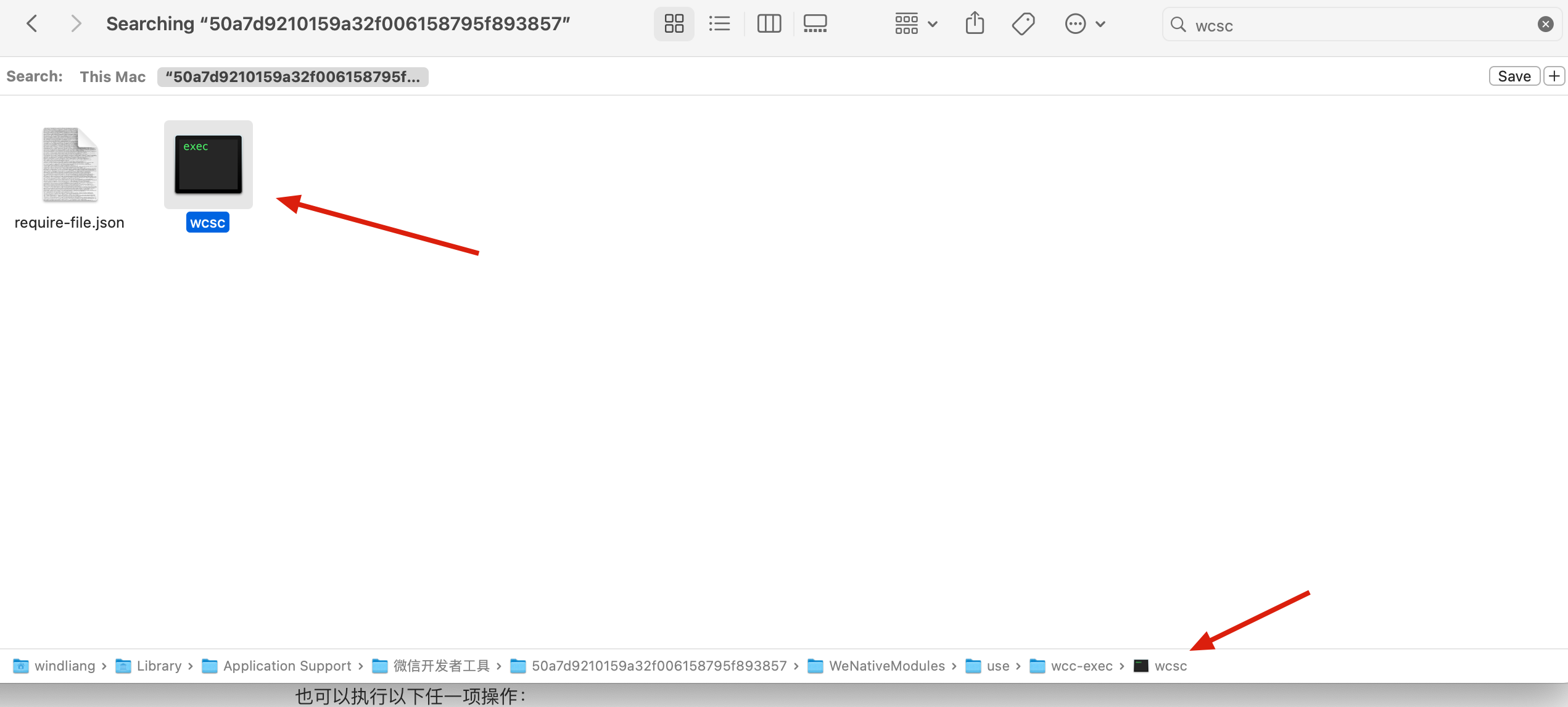
是微信帮我们把 wxss 进行了编译,编译工具可以在微信开发者工具目录搜索 wcsc ,Library 是个隐藏目录。
我们把这个 wcsc 文件拷贝到 index.wxss 的所在目录,然后将我们的 wxss 手动编译一下:
1 | ./wcsc -js ./index.wxss >> wxss.js |
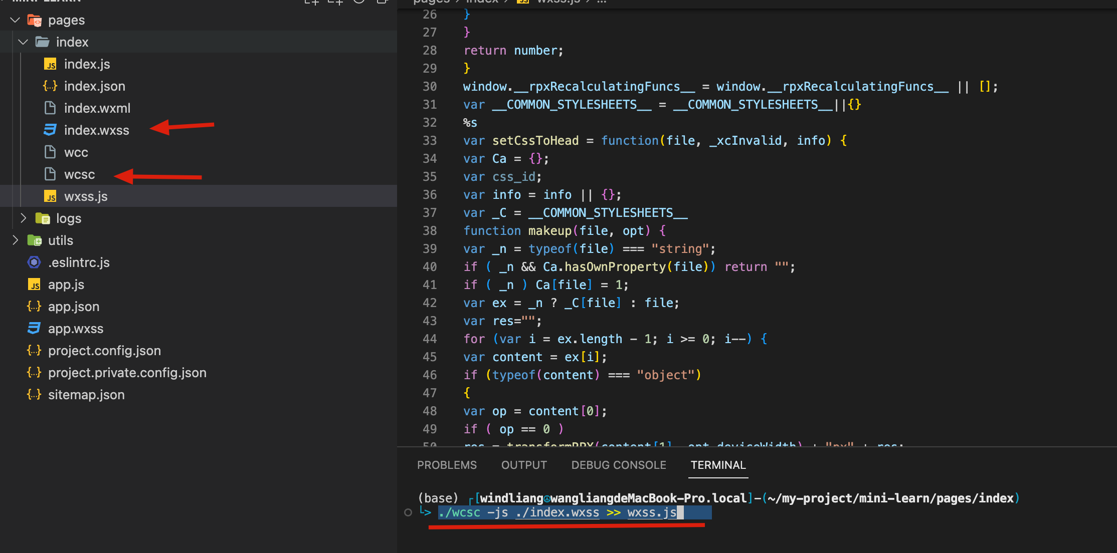
此时会发现生成的 wxss.js 就是我们上边分析的全部代码了:

总
因此对于代码 wxss 到显示到页面中就是三步了,第一步是编译为 js,第二步将 js 通过 eval 注入到页面,第三步就是 js 执行过程中把 rpx 转为 px,并且把 css 注入到 style 标签中。